Ever wondered how to increase clickthroughs and capture as many sales as possible without going through the lengthy, sometimes risky, and often costly process of completely changing your Shopify store? In the bid to bring you the very best ways to improve e-commerce conversion rate optimization, let us introduce you to the concept of heat mapping. To discover heatmaps means to up your conversion rate.
Top tip: You can instantly up your conversion rate by switching to the Shoptimized™ Shopify Theme, it loads lightning-fast and converts like no other.
What are heatmaps?
E-commerce optimization can be brought about through incentives such as money/percentage off and email promotion. But heatmaps are a way to make your site convert better, with only a few minor changes needed. Heatmaps analyze website usage data using color coding to visualize how customers interact with a landing page and content. They can illustrate which bits of a page draws visitors’ eyes the most and what makes them click through to other pages on your site, or stay longer. Some heatmaps will measure clicks on a web page, while others gauge the attention people give to particular areas. Such as offering valuable information on how they interact with your site, landing pages, and content.
Are your calls to action placed wisely?
Through heatmaps, you can see the headlines and images that draw visitors in and make them click on a given link. This is also what pulls people away from the things you really want them to see.
An example of this was when WPMU Dev used CrazyEgg’s confetti report to see how visitors interacted with their CoursePress product page. It identified parts of the navigation menu and important videos that visitors ignored. Thanks to this form of testing, it transpired there were too many calls to action on the page. That means it was hit and miss whether visitors clicked where they were supposed to.
How easy to navigate is your site?
Heatmaps are also a good way to find out whether people navigate your e-commerce site well. It can also locate search options easily and are interested in the content that you provide.
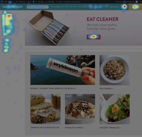
When UK-based healthy snacks provider Wyldsson, launched a smart new website which had been months in the planning, they discovered, to their dismay, that their sales come down. After using heatmaps to see how visitors were interacting with the store, it became apparent that the shop wasn’t functioning correctly on some people’s browsers.
So, in this case, instead of highlighting the fact that the call to action was in the wrong place or hidden. The heatmap showed a completely different problem that could easily be rectified. After sorting out the issue, through assessing visitors’ behavior on the site, sales went up again by 30%. And that is why you need to discover heatmaps.
The Results
The results once the browser became compatible.
Remember: It can be all well and good having a site which is all singing/ all dancing. But take the time to invest in what works for your customers and you’ll up your click-through rate in no time.
A heatmap can also see which parts of the page are hot (looked at the most) or cold (pretty much ignored). So, if your call to action is in a place where visitors don’t look, for example, more than halfway down the page, then effectively, it may as well not be there at all.
Pagely used CrazyEgg’s scroll map to identify that fewer than 25% of their visitors scrolled beyond 600px, which meant that a lot of the page was ignored. This led them to rethink the layout to ensure that visitors saw the most important information, by placing it at the top.
In a similar way, E-commerce site owner Hans van Leersum built an online store not just focused on selling. Also, they’re delivering an experience suited specifically to the customer and he increased his conversions by 11%.
How the CTA performed after heatmapping?
The data showed the primary call to action was originally placed on the page where very few would see it. But, with a simple move of a button to further up the page, he was able to make vast improvements to his click-through rate.
In another example, Softmedia used heatmaps to identify distractions that were preventing visitors from completing the desired actions. After removing these, conversions increased by 51%.
Once you’ve seen where your visitors’ interest lies on a page, you’ll know where your call to action should be, (more often towards the top of the page), right in the place where you know 100% of your visitors are looking.
But that’s not all…
What else can we learn from using heatmaps?
Here are some common findings that often come from using heatmaps to discover reasons for customers’ behavior:
- Visitors tend to buy the most noticeable things.
- People often look on the left-hand side of the page and in an F-shape. Here’s where to put the important stuff.
- Men are normally drawn to visual symbols, while women most often search for information.
- Stark color contrast will draw the eye.
- Photos of people get attention. Bear in mind where the people in the photo are looking. The visitor’s eyes will be drawn in that direction.
- Consider the age of the user – if they are more elderly, should the site be easier to use? Is this the reason why people are giving up at a certain point?
- Visitors are put off by content that looks like advertising.
- Big blocks of text are more off-putting than punchy headlines and attractive images.
- Less is often more – don’t overwhelm the visitor with too many design elements.
To find out more about optimizing your e-commerce site and using heatmaps to enhance the user experience, contact us today.